
Sunday 28 November 2010
Double Page Spread Images

Gif animators

Make a gif

Gif generator
I took these pictures at Rihanna's Tour in Liverpool in May 2010. In the end I decided to use this image on my double page spread.

Saturday 27 November 2010
Double Page Spread
I made this video in iMovie. To show the changes and progress I have made to my double page spread.
Friday 26 November 2010
Contents Page
I made this video on iMovie. To show the progress and changes that have been made to my contents page.
Thursday 25 November 2010
Article Research
For my article research on Rihanna, I prepared interview questions and found websites with information on them about Rihanna. I also researched the history of the band.
Rihanna
Interview Questions
What songs have influenced you whilst writing your own lyrics?
Why and when did you decide you wanted to be in a band?
Where do you see yourself in 5 years time?
What is the best gig you have ever played?
How would you describe you style of music?
Website links
History
Born in Barbados
Brought out 5 albums
Style changes all the time
Famous for Chris brown assault
Wednesday 24 November 2010
Music Magazine Drafts
In todays lesson we drew drafts of what our magazine front cover and contents page would look like.
 |
| This is my front cover |
 |
| This is my contents page |
Tuesday 16 November 2010
Planning Production
In todays lesson we had to create the planning production for our magazine. We had to write all the text for our contents page and note the ideas for our double page spread and front cover. This is mine.
Planning Production
Front cover
Images
. Main image – band The Colliders
Coverlines
. Main cover line – The Colliders (subline à New Album, New Look)
. Take That & Lady GaGa Tours
. Katy Perry V Pixie Lott
. Rebirth of Boybands (subline à JLS, Westlife, The Wanted
. FREE Kings of Leon Poster
Contents Page
. Contents list –
Regular Content
Page 16-This weeks top 10
Page 19 – Gig Guide
Page 23- New indie/rock artists
Page 59- Snow Patrol Top 10
Page68 - Band of the month
Feature Conetent
Page 4- V festival (subline à The Killers, Kasabian, The Kooks + more)
Page 7-Kings of Leon (subline à Radioactive review)
Page 28- Rebirth of Boy Bands (subline àJLS, The Wanted, Westlife)
Page 31- Black Eyed Peas (subline à Interview with the band)
Page 34- Oasis (subline à throughout the years)
Page 39- Take That (subline à Progress tour)
Page 44- Mr Hudson (subline à Straight No Chaser album review)
Page 47- Lady GaGa (subline à Monster Ball tour)
Page 52- Rihanna (subline à Whips And Chains Excite Me)
Page 64- Katy Perry V.s Pixie Lott
Page 72- Cheryl Cole (subline à Promise This Review
Page 79 – The Colliders (subline à New album, new look)
Page 84 – The Saturdays Interview
. Images -
Main image of Black Eyed Peas Concert
Mr Hudson outside concert
Rihanna in concert
V Festival crowd
Main Article
. Interview with Rihanna- her sexuailty in her songs
. Images of the her in concert as main image
Tuesday 9 November 2010
Publication Plan
In todays lesson we made the publication plan for our music magazine. We have to stick to the plan whilst making our magazine. These are the ideas I came up with for my magazine.
Publication Plan
Title: SpECTRUM
Positioning Statement: Rise to the Sound!
Frequency of Publication: £2.99
Distribution: Newsagents, supermarkets, airports, music shops.
Rationale: The approach of the magazine is from the reader’s perspective and will contain review, interviews and pictures about the bands which are most popular right now in order to appeal to more readers.
Style: Informal and cheerful style, strong opinions are shown but a comical approach is also taken. The magazine is for the younger generation so the type of words used will be simple and slang will also be used.
Regular Content
. Tour dates
. Competitions
. List of top 10 songs
. New music
. Fans letters
Feature Content
. V festival (The Killers, Kasabian, The Kooks + more)
. Rihanna Review
. Rebirth of BoyBands
. Ema Music Awards
. Kings of Leon, Radioactive review
. Bruno Mars interview
. Oasis throughout the years
. Take That Tour
. Mr Hudson album review
. Lady GaGa Tour
. Snow Patrol Top 10
. Katy Perry V Pixie Lott
. Cheryl Cole, Promise This review
. Gig Guide
House Style
Coverlines: Impact
Headlines: Arial Black
Standfirst: Candara 14pt
Captions: Candara 8pt
Features first paragraph: drop capital Candara Bold 5 lines deep.
New first paragraph: first two words in bold.
Body text: Cambria Math 11pt
Colour Scheme: Red, Black, White
Wednesday 3 November 2010
Voice Recordings
In todays lesson we took recordings of some of the questions in our questionnaire. We then converted them to a video clip on Adobe Premier Pro. The first clip is of the question What is your age? and the second Who is your favorite band/artist?
Tuesday 2 November 2010
Questionnaire Results Presentation
In todays lesson we made charts to show our results from the questionnaire, we then wrote a conclusion about each question. To show the results we made a slideshow on Powerpoint and then uploaded it to slideshare.net
Thursday 21 October 2010
Questionnaire
In todays lesson we had to make a questionnaire about music magazines. The questions were about our particular genre of music magazine. Mine is Pop/Rock so the questions are linked to this. We had to give it out to 20 people and tally up the results.
This is a copy of my questionnaire.

This is a copy of my questionnaire.

Analysing Double Page Spreads
In today's lesson we looked at double page spreads in music magazines and analyzed the codes and conventions they share. I found that they all have:
. A main images that takes up at least a full page and often bleeds across to the other page.
. Drop caps are used to start paragraphs.
. The font used for normal text is ariel in size 11.
. To lay the page out 3-4 columns are used.
. Drop quotes are used out of context so you have read the whole article to find out. They are often in a bigger font.
. By-lines are written to give credit to the photographer or writer.
. A stand first is used in bigger size font and always placed near the top of the page.
. The main title is in a bigger size font to the rest of the writing and is often in a different colour.
. a consistent colour theme of around 3 colours is used on this page and throughout the magazine.
. At the bottom of the page the magazine name, issue date and page number are written in a small size font.
. In the text an artists name is always highlighted in a different colour or in italics.
. An informal mode of address is used to make the text seem more friendly for the reader.
. there is white space in between each section so that it does not look over crowded.

This is an example of a double page spread from 'Kerrang'.
Annotated Contents Page
In todays lesson we had to annotate a contents page on Word and the upload the picture to a website caled Prezi and make a presentation on it about what we did. This is the link to my presentation.
http://prezi.com/5ggvyu9sad3p/analysing-contents-pages/
http://prezi.com/5ggvyu9sad3p/analysing-contents-pages/
Wednesday 13 October 2010
Annotating Front Covers
In todays lesson we had to get three front covers for different magazines and annotate the codes and conventions on them.


Initial Plans 2
My initial ideas for the magazine are:
. Price - £3.99
. Frequency of magazine - monthly
. Average issue size - 60 pages
. Regular content - Gigs, reviews, bands
. feature articles - interview with band
. Price - £3.99
. Frequency of magazine - monthly
. Average issue size - 60 pages
. Regular content - Gigs, reviews, bands
. feature articles - interview with band
Tuesday 12 October 2010
Research For Music Magazine
In today's lesson we had to go online and find out about music magazines to do with the same genre of music our magazines will be about.

NME costs around £2.30 and has around 60 pages of contents. The website for the magazine is www.nme-magazine.com. The strapline is New musical express. The magazine regularly contains articles on famous band and interviews with them. It also has reviews on new bands and songs. The publishers address is http://www.ipcmedia.com/


Kerrang costs around £2.75 and has around 80 pages of contents. The stapline is Life is loud. The magazines website is www.kerrang.com. Like other magazines it regularly included reviews and interviews with bands. The publisher website is http://www.bauemedia.com/

Mojo costs around £4.30 and contains about 150 pages. The website for the magazine is www.mojo4music.com. Its regulars include reviews on songs and interviews with bands. The strapline is The music magazine. It also has an ask fred section. The publisher website is http://www.bauermedia.co.uk/

NME costs around £2.30 and has around 60 pages of contents. The website for the magazine is www.nme-magazine.com. The strapline is New musical express. The magazine regularly contains articles on famous band and interviews with them. It also has reviews on new bands and songs. The publishers address is http://www.ipcmedia.com/

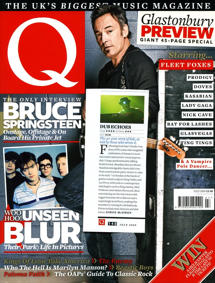
Q costs around £3.90 and contains around 160 pages. The website is www.qthemusic.com. The strapline is The Uk's biggest music magazine. It's regular contents included reviews, interviews and new music. Its publisher adress is http://www.bauemedia.com/

Kerrang costs around £2.75 and has around 80 pages of contents. The stapline is Life is loud. The magazines website is www.kerrang.com. Like other magazines it regularly included reviews and interviews with bands. The publisher website is http://www.bauemedia.com/

Mojo costs around £4.30 and contains about 150 pages. The website for the magazine is www.mojo4music.com. Its regulars include reviews on songs and interviews with bands. The strapline is The music magazine. It also has an ask fred section. The publisher website is http://www.bauermedia.co.uk/
Sunday 10 October 2010
Main Task: Initial ideas
The type of music magazine I think I am going to produce is pop/rock. I think that the target audience for my magazine will be mainly males around 16 - mid 30's.
School Magazine Evaluation
I have designed my media product to follow the codes and conventions of a real magazine. To do this I have laid out the the different objects on the page in similar way to which a real magazine would, such as having the name of the magazine at the top of the page and in a large font. One way in which I have differed my magazine to others is by having the main image not covering a section of the title. I have done this because my magazine is not well known unlike others whose name can be understand even when covered.
The new media technology I used to produce my magazine was Quark. I used it to create columns on my page which helped me with the layout of my contents page. It also helped me add effects to my page such as changing the opacity of certain objects. This gave my magazine a more professional look to it.
The strengths of my magazine are that it uses a colour theme well and this helps it look professional and like a real magazine. Also I feel that I have placed everything in the right place to stick with the codes and conventions of a real magazine. The weaknesses of my magazine are that due to the time in which I had to complete the Magazine I rushed the written information on the page and did not come up with the best feature articles to advertise in my magazine.
The strengths of the new technology I have used are the way in which i can lay out my magazine using the guidelines it places on the page. The weaknesses of this new technology are that I am still learning how to use it and therefore am not using it to the best of its abilities.
Friday 8 October 2010
School Magazine Contents Page: Final Design
I designed my page on Quark. To make it look professional I set it out in 3 columns. I have placed the words contents at the top of the page in a large font. I have kept to the same colour theme as the front cover. My articles run down the left hand side of the page and use size 11 font. The page numbers have been highlighted by the use of a bigger size font and in a different colour. Smaller pictures have been placed at the bottom of the page and have also been numbered, these are my feature articles. A border has been placed at the bottom of the page with the name of the magazine showing. I have also included a letter from the head teacher to welcome the readers. The issue date and website have again been placed on the page in a small font.
 |
| This is my contents page. |
School Magazine Front Cover: Final Design
To produce the front cover of my magazine i used Adobe Photoshop. The reason my front cover looks the way it does is because i stuck to the codes and convention of a magazine front cover. The title 'GeeK' takes up around 25% of the front cover, and it at the top of the page. My main image links in with School and is a Medium Close up. I have used the colours: white, black and red as the theme for my magazine. Puffs run down the left hand side of the page to advertise my feature articles. The issue date and website are placed in the bottom left of the page and in a smaller font.
 |
| This is my front cover. |
Wednesday 6 October 2010
QuarkXPress
In today's lesson we were given a demonstration of Quark. This is the software we will be using to make our contents pages and other work from now on. We were shown how to create new pages, import images and text and also how to distort and move objects around the page.
 This is a screen shot of me editing an image and some text on Quark

Thursday 30 September 2010
Editing Images on Quark
In this lesson we went on Adobe photoshop to edit our images for the magazine. We use a range of tool and effects to edit our images.

For this picture i used the magnetic lasso tool to cut around the image and then delete the background.

In this picture i was using the brush tool to cover up certain parts of the image i did not need.

For this picture i used the magnetic lasso tool to cut around the image and then delete the background.

In this picture i was using the brush tool to cover up certain parts of the image i did not need.
Magazine Pictures
In todays lesson we were all given cameras and told to take pictures which we will need for our front cover and contents page.  This picture is for my front cover.  This picture is my main picture for my main feature article on the contents page.  This picture is for one of my feature articles and will be on the contents page.  This picture is for my background on the contents page.  This picture is for one of my feature articles on the contents page.  This picture if for another one of my feature articles and will be on the contents page. |
Wednesday 29 September 2010
Drafts of Front Cover & Contents Page
In todays lesson we had to design what are front cover and contents page would look like. Our magazine is a school magazine so everything on them had to link in with school. I called my magazine Geek to tie in with a classic school stereotype. This is what i came up with...


This is what i came up with for my front cover.

This is what i came up with for my contents page.
Friday 24 September 2010
Practise Shots
In todays lesson we learnt about all the different camera shots and what they are used to achieve. For example a extreme long shot is used to set the scene. We then were split up into groups and had to go around the school and take pictures of the different shot types. This is what Me and Nicola took.


Wednesday 22 September 2010
Codes & Conventions of Music magazine : Contents Page
Just like front covers, we were given a number of contents pages to look at and make a list about the codes and conventions they all share. We found that they all have:
. A theme that matched the front page and continues throughout the magazine. It had between 3 to 4 colours in it.
. At the top of the page the word 'Contents' are placed but not always on the left hand side.
. Generally laid out in 3 columns.
. The main image on the page is to do with music and bands, but is to do with the main feature article. All the pictures have the page number they are linked to on them, the page numbers are in a different colour. A caption is also written underneath them.
. There is a credit to the photographer who took the picture on the front cover, because no credits are placed on the front.
. The issue date and website of the magazine are also in small near the bottom of the page.
. Some magazines have a letter from the editor saying what is in the issue.
. There is also a smaller picture of the front cover of the magazine.
. Subscriptions are advertised on the page for people who want the magazine every time it is released.
. The masthead for the magazine is also placed on the page but is a lot smaller than it was on the front page.
. Some magazines have a welcome message to new readers of the magazine.
. Buzz words are used to show the most interesting and exciting articles. They are bigger and more colourful.
. There is space in between each section so that it doesn't look to crowded and busy.
. There is usually about 20 feature and contents articles advertised on the page.
. For the basic words and information size 11 font is used.
. The page number always comes before the text. The average font size is 12/13 point.
. A subline is after this, this tells you in more detail about the article in Times New Roman ans is no bigger than size 11 font
. The page number always comes before the text. The average font size is 12/13 point.
. A subline is after this, this tells you in more detail about the article in Times New Roman ans is no bigger than size 11 font
We then shared our ideas with the rest of the class. Here are a couple of music magazine contents pages.


Codes & Conventions of Music Magazine : Front Cover
In todays lesson we looked at the codes and conventions of a music magazine front cover. We were given a number of various magazines to look at and had to make a list with the key features they all include. These features are:
. The masthead being in the top centre or top left of the page and taking up around 25% of the page. It is also in its own font. Its name usually gives an idea to the genre of magazine.
. The barcode, price and issue date all being next to each other at the bottom and a lot smaller than the rest of the of the features on the page.
. Buzz words in a different colour and bigger size font to make them stand out from the normal text.
. The theme of the front page uses 3 to 4 colours and this theme continues throughout the magazine. It is also designed to be aesthetically pleasing.
. The main image is either a close up or medium close up of the artist or if its a band it is a long shot. The main image is the biggest thing on the page. It stands out from a plain background. as well as this it also covers a part of the masthead if the magazine is well known.
. There is about 5 to 6 cover lines on the page. The main one is for the main image. They are a different colour and bigger size font to stand out.
. Puffs can also be used to advertise certain areas of the magazine.
. Smaller images are used to show some of the feature articles in the magazine.
. Only a few fonts are used on the page. Like Serif , Times New Romand and Sans.
. Only a few fonts are used on the page. Like Serif , Times New Romand and Sans.
We then got in a group and shared our ideas. Here are a few examples of music magazine front covers.


Subscribe to:
Posts (Atom)